All images from Amazon .
.
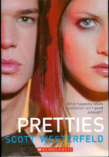
"What happens when perfection isn't good enough?" I love the sparkle in the girl's eye on the first cover, but I think the second one is my favorite. We all know that Barbie's proportions are unrealistic and the tape measure in the image just adds to that. The third cover may catch my eye in a store, but I'm not really sure. It would probably do so more if it were next to the other new hardcovers. I think they look really good together as a set.
Which one is your favorite?


0 comments:
Post a Comment
Comment away, my friends. I love to chat with you guys. :)